Case study

Snowbro

“We need a new logo to show we’re much more than a retailer of ski gear.”

CLIENT Snowbro INDUSTRY Ski & Snowboard Shop / Snow Sport Travel Experiences SERVICES Logo Design
Branding
PROJECT Logo + Business Cards + Letterhead

The client / the challenge

Snowbro is a ski and snowboard retailer who were branching out to offer snow-sport travel experiences. Their old name, The Snow Room, no longer represented the company, and their clientele only knew them as a retailer of gear and clothing. They felt they had outgrown their old logo and needed something more sophisticated. Snowbro were keen to attract the attention of new skiers and snowboarders to their travel experiences and to educate existing clients about their new service as well.

Our strategic solution

We quickly saw the client needed to add a sense of “aspirational adventure”, “snow” and “speed” to their brand. We also aimed to communicate the new service on each and every piece of collateral. We designed a logo, business card and more to appeal to the Australian snow-sport crowd to help Snowbro stand out, be heard and grow.

CLIENT Snowbro INDUSTRY Ski & Snowboard Shop / Snow Sport Travel Experiences SERVICES Logo Design
Branding
PROJECT Logo + Business Cards + Letterhead

Along with a logo marque and new typography, we designed an aspirational scene based on a dynamic photograph of the client on one of his own snowboarding adventures in the Alps.

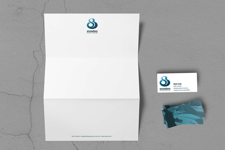
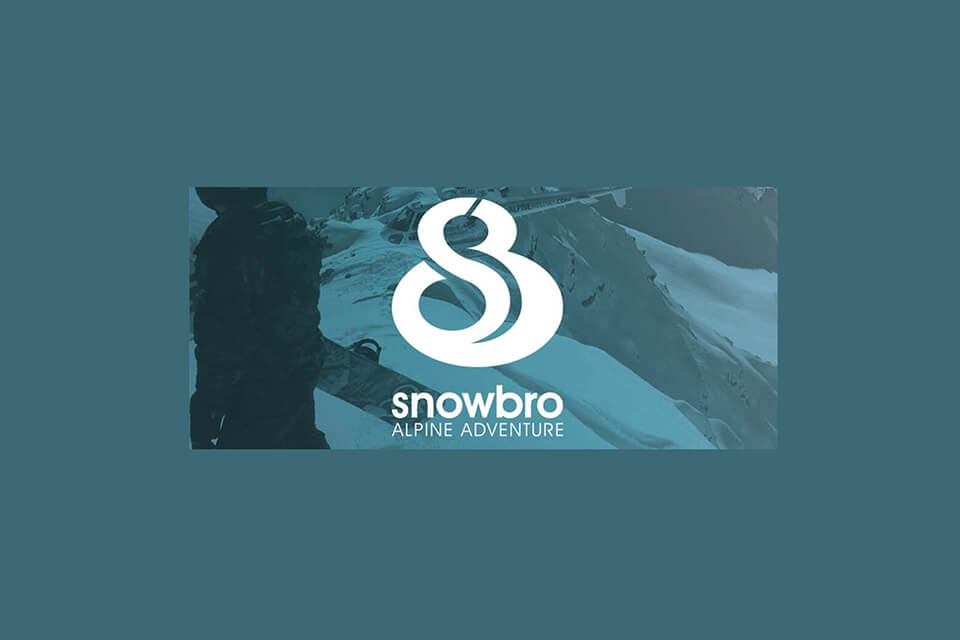
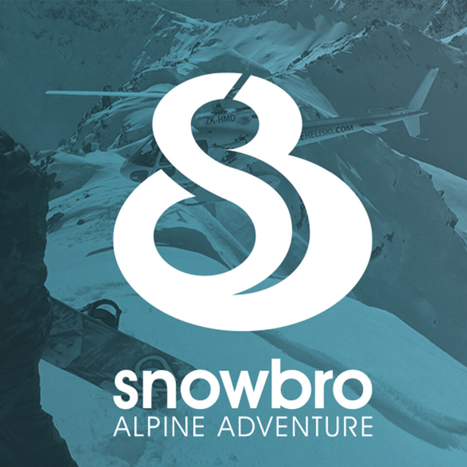
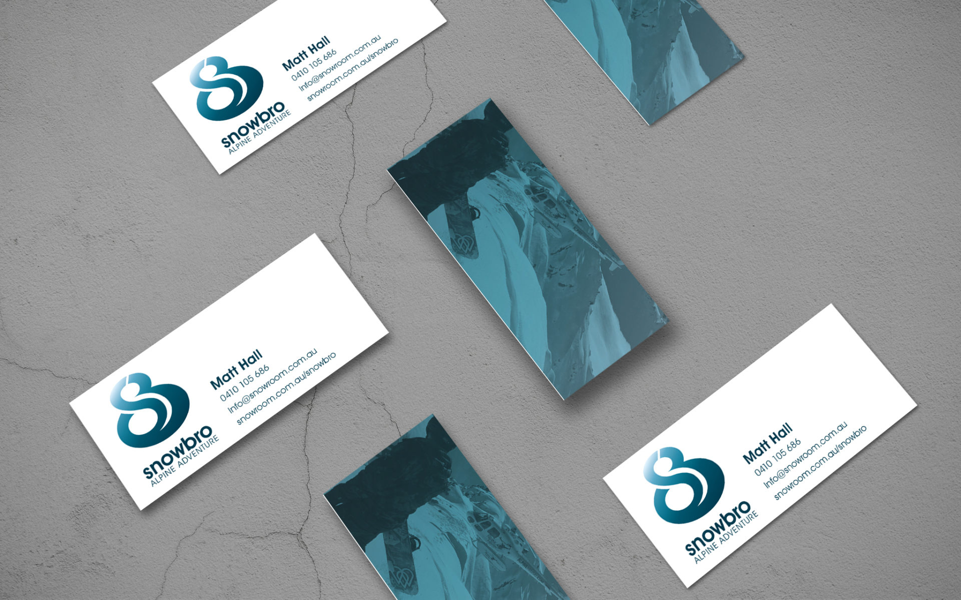
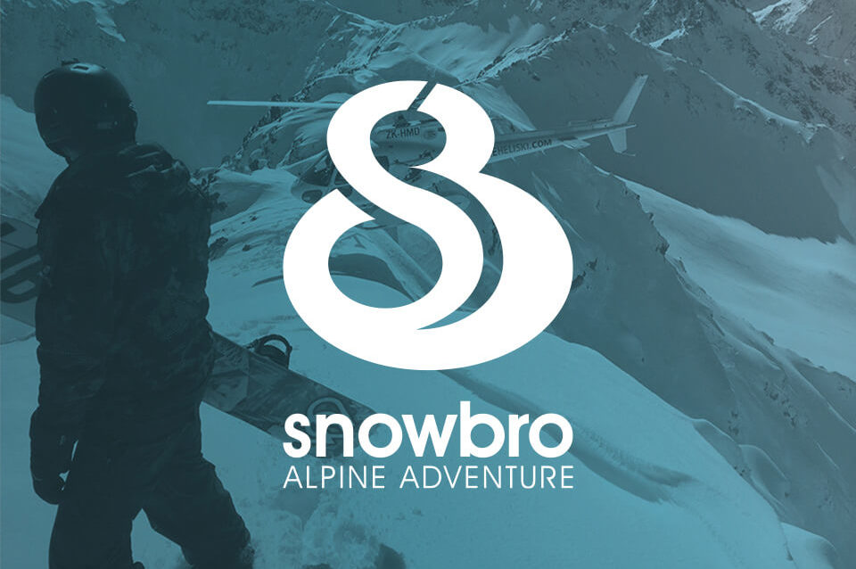
The dynamic logo marque comprises not only an interlocked capital “SB” – for Snowbro – it also takes the form of a ski trail when viewed from above.

The logo marque imparts a sense of movement and speed to the still image. The green-blue overlaid on the image evokes the unique mood of alpine snow sports, referencing the colour of glacial ice and mountain skies as well as the feeling of breathing cool, crisp air.

We rolled the logo out across Snowbro’s business cards and letterhead, including the tagline “Alpine Adventure” on every piece of collateral to educate the brand’s audience at a glance about their new service.

While we created a completely new logo for the brand, we kept a little of the black, blue and white colour palette to reference the old logo. We changed the tint and the look and feel dramatically to better match and express the new brand’s personality and offering.

BEFORE: their old logo
AFTER: our new logo design

Ready to grow your brand?

TALK TO US